
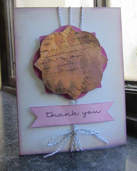
- Stamps – Stamper’s Anonymous Tim Holtz Collection “Reflections” and My Favorite Things “Pretty Poppies” (Thank You)
- Stencil – Crafter’s Workshop mini stencil “Harlequin”
- Dies – Spellbinders “Vintage Labels Three”
- Cardstock – Bazzill
- Baker’s Twine
- Ranger Distress Inks and ColorBox Chalk Inks
I’m taking the Online Card Classes Summer Card Camp 2, which is really packed with great information. I would highly recommend this class and have been pleased with many other classes offered by them. This week we are challenged to work with a specific color palette and three sketches, if we so desire. The color palette includes light and dark brown, light and dark magenta/purple and a light blue. I was inspired by a lesson Kristina Werner gave us and created the focal image on this card by creating a panel with Distress Inks on watercolor paper. I added some home-made spritzes of Distress ink with Perfect Pearls and layered some stamping and stenciled images. I then die cut this inkiness using a Spellbinders Vintage Label die and layered it atop a cardstock die cut a hair bigger that I offset. I created the sentiment and inked up all of the elements with chalk ink to tie together the color scheme with the lighter purple. Before I built the card, I tied baker’s twine onto the base and then applied the other elements on it using dimensional adhesive. Thanks for visiting!


Please Leave a Reply